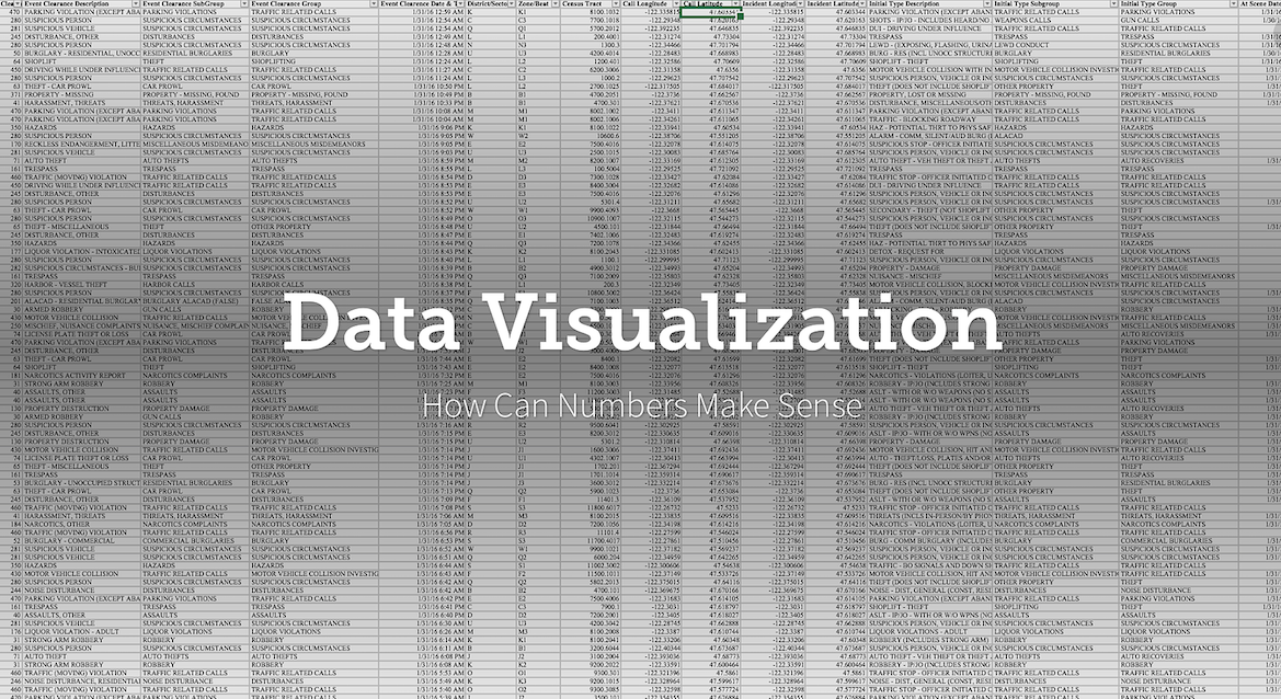
This project is a set of user-centered data visualizations (click to view): enabling tons of the numeric and descriptive data to make sense and be friendly to the audience. I learned and utilized the powerful and handy data organizing software called Tableau to visualize the 911 call records of the entire month of January 2016 from the Seattle Police Department. To begin with, I examined the data set by interpreting what types of data were included, of which were accurately documented, and how do they interact with each other. Then, I focused on the traffic-related calls and selected the traffic patrols and enhancement section as the audience of the data. Due to the lack of prior experience with Tableau, I also watched tutorials and did some researches. Finally, after playing around the features and data set, I made three visualizations of the given data and mastered and learned the concepts and techniques of achieving data organization and visualization.
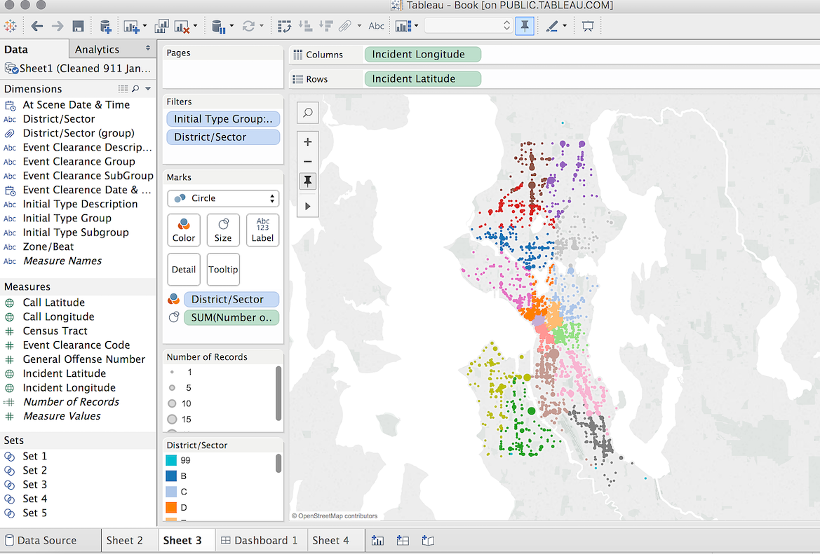
These visualizations, with greats stakes in terms of traffic improvements in urban areas and real-time traffic information sharing platform, can be very powerfully implemented in the future. Besides, the traffic patrol officers, the largest group who can benefit from these are all the drivers on the roads. Learning the patterns of their frequent driving paths in terms of time and place, they can better select their approaches. Also, these can be used for alerting and education: once they have known so many accidents happened in some particular spots, they are likely to be more careful and focused on driving on those roadways. The blueprint also includes real-time data sharing: all the reports will be simultaneously displayed on the cell-phones and their navigation systems--all real-time map, and the statistical charts on hourly, daily, weekly, and monthly basis.